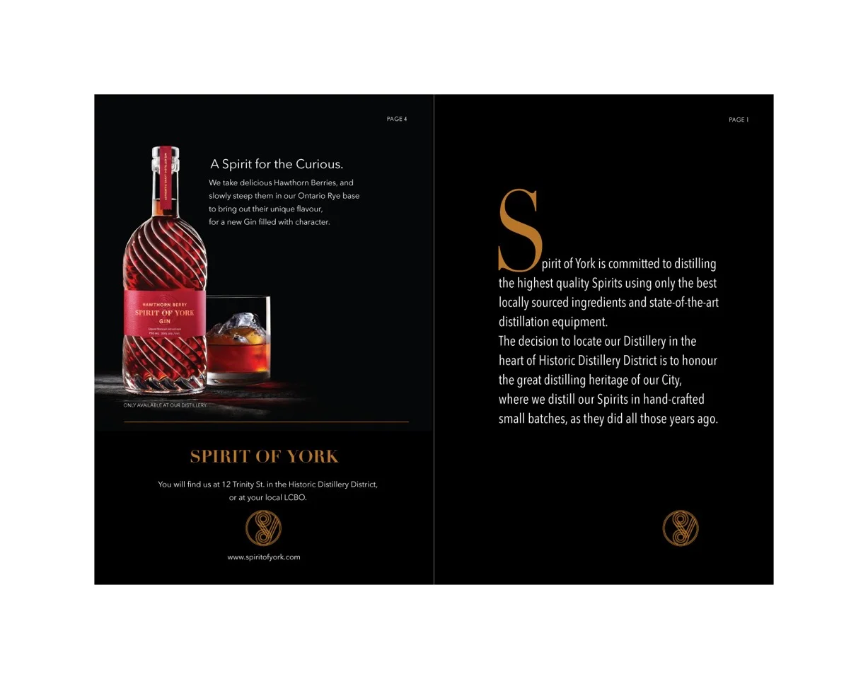
Spirit of York - Folder
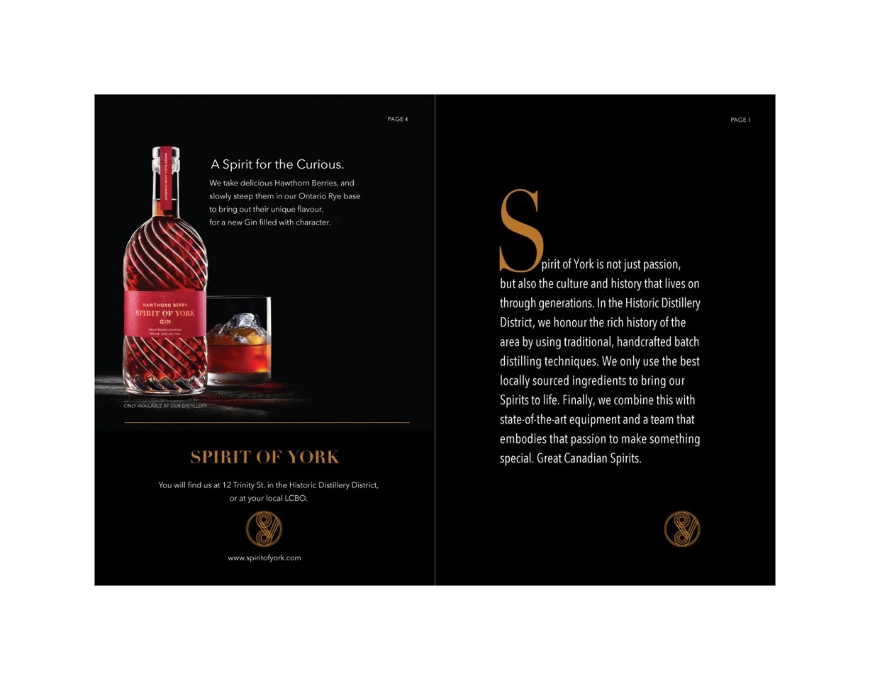
This was a folder designed to feature all the products and explain the brand in one convenient package. The copy above was my more emotional take on the brand and what they stand for. The goal was to hit on the key points such as the process, the combination of old and new, the ingredients, and the passionate spirit, but in more of a storytelling format.
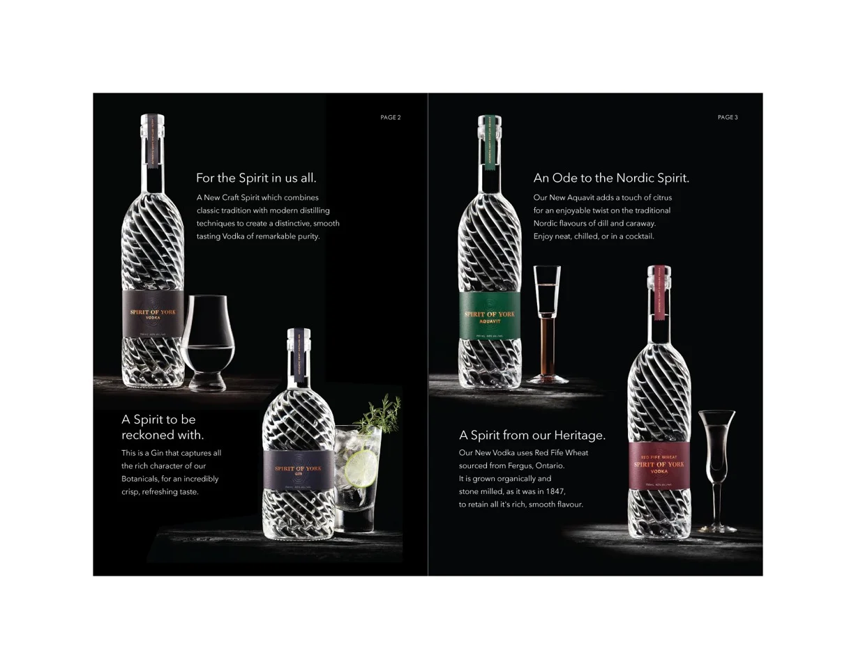
Here is the inside of the folder, which features the different products the brand has to offer. I wrote each piece of copy to highlight the unique qualities of each, while keeping with an overall structure, and ending with a taste description.
Each section also has a tagline that pairs with the product in some way. The core vodka is “for the spirit in us all” as the first product, the gin is “a spirit to be reckoned with” as it has a bold flavour that appeals to many who don’t normally like gin, the aquavit is “an ode to the nordic spirit” as it aims to satisfy those who love this classic spirit, the red fife wheat vodka is “a spirit from our heritage” as it is based around a Canadian heritage grain, and the hawthorn berry gin is “a spirit for the curious” since it provides a very different flavour than the rest of the line.
Below is the alternate copy that I wrote for the front of the folder. It is made to present the core qualities of the brand in a very succinct way. My attempt here was to communicate these ideas in a way that reads smoothly and in an interesting way, given its straight to the point nature.